

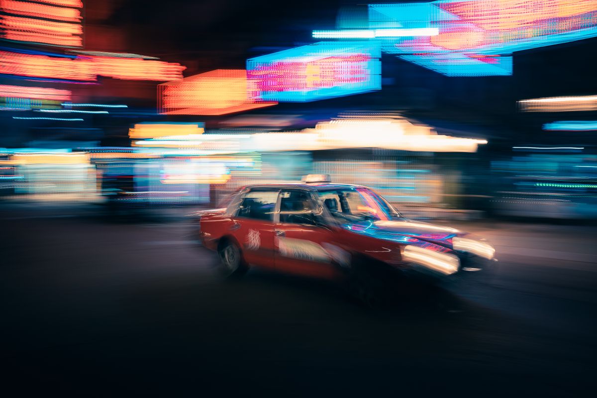
There's a Hong Kong you can still see in Wong Kar-wai films — rain-slicked streets, red taxis blurring past, and above it all a wall of neon signs stacked ten deep, glowing pink and yellow and green and blue, spelling out restaurant names, mahjong parlours, pawnshops, and cha chaan tengs in fat brushed characters. That Hong Kong is disappearing. Fast.
Between 2010 and 2020, an estimated 90% of Hong Kong's neon signs were dismantled. What's left is a fraction of the city's most iconic visual language. If you love Cantonese culture, understanding what neon meant to Hong Kong — and why it's vanishing — is essential to understanding how the city is changing.
A Craft That Arrived in the 1930s
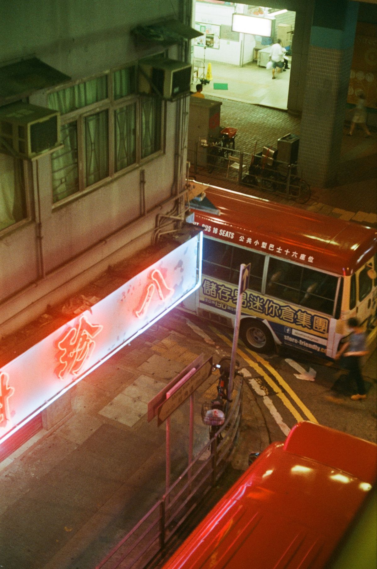
Neon signage in Hong Kong began in the 1920s when the first neon tubes were imported from Europe and the United States, and it took off after Claude Neon Light opened the city's first neon factory in 1932. By the 1950s, as post-war Hong Kong exploded into a manufacturing and trading powerhouse, neon signs became the default way for shops, restaurants, and hotels to announce themselves. From the 1950s through the 1980s, entire building facades in Mong Kok, Tsim Sha Tsui, and Wan Chai were covered in dazzling stacks of neon, some projecting 15 metres out over the street.
Foreign visitors called it 'the city that never turned off'. Cantonese locals just called it home.
The Two Crafts Behind Every Sign
A Hong Kong neon sign was actually two art forms glued together. First, a Cantonese calligrapher would hand-brush the characters onto paper, sometimes on the pavement using ink and a giant brush. The most famous were figures like Fong Kai and Au Yeung Cheong, whose bold, muscular strokes became the city's default commercial typography. Their brush styles are as recognisable to a Hong Kong native as Helvetica is to a graphic designer.
Then the drawing went to a neon-bender — called a 'neon shifu' — who heated 8mm and 10mm glass tubes over a blowtorch and shaped them by hand to match the calligraphy. Each character required dozens of joints, angles, and curves. The gas inside determined the colour: neon for red-orange, argon plus mercury for blue, phosphors on the inner glass for pink, green, yellow. A single storefront sign could take a week to build and hang.
Why Neon Fit Cantonese Culture
Cantonese street culture is loud, competitive, and dense. Hong Kong shops had to fight for attention on streets stacked with a hundred businesses per block. Neon was the perfect tool: bright, cheap enough for a small family shop, endlessly customisable, and visible for blocks. Every restaurant, hair salon, mahjong parlour, and pawnbroker had one. The city's visual identity became a competitive collage of glowing Cantonese characters, layered so thick that Blade Runner literally borrowed the aesthetic in 1982.
The signs also carried meaning beyond marketing. Herbal tea shops used soft green neon to signal calm. Nightclubs used pink and purple. Pawnshops used a distinctive bat-and-coin design that had been a Cantonese trade symbol for centuries. If you knew how to read the streets, the neon told you exactly what kind of block you were on.
The Government Campaign That's Dimming the Skyline
In 2010, Hong Kong's Buildings Department launched an aggressive enforcement campaign against unauthorised projecting signage. The rules were legal and often reasonable — many old neon signs were technically illegal structures that hadn't been permitted or maintained properly for decades. But the enforcement was ruthless. Removal orders went out in the tens of thousands. Owners had 60 days to comply. Most signs came down.
At the same time, LED technology got cheaper and easier to install. New businesses chose flat LED panels instead of glass-blown neon because they lasted longer, drew less power, and didn't require a specialist to build or repair. The remaining neon shifus — by 2020 there were fewer than ten actively working — mostly retired. The craft is being lost in real time.
Sammy's Kitchen and the Cow That Went to a Museum
One of Hong Kong's most beloved neon signs was the 10-foot-tall, 16-foot-wide cow that hung above Sammy's Kitchen, a Sai Ying Pun steakhouse. Installed in 1979, the cow was designed by proprietor Sammy Yip and became an unofficial neighbourhood mascot. In 2014, the Buildings Department ordered it dismantled. Instead of destroying it, the M+ Museum acquired the cow for its permanent collection. Today it hangs in a temperature-controlled gallery, glowing safely, no longer part of the streetscape it belonged to.
There's something painful about a neon sign in a museum. Neon was never meant to be observed — it was meant to hang above the rice noodles, the roast meat, the mahjong tiles clacking on tables. Once you put it under a spotlight, it stops being neon and becomes an artefact.
Who's Trying to Save It
A quiet resistance movement is fighting to preserve what's left. The M+ Museum has documented and archived hundreds of signs. The Hong Kong Neon Heritage group organises walking tours and workshops with the last living shifus. Photographers like Keith Macgregor have spent decades photographing the disappearing signs so the visual record survives. And a new generation of artists and designers is deliberately commissioning small neon pieces — for shops, for art installations, for restaurants — to keep the craft alive on a smaller scale.
You can still find working neon in Yau Ma Tei, in the Temple Street night market, above old Chiu Chow restaurants, and around the last few mahjong parlours. Some are behind museum glass now. Others are still hanging where they always have. If you're visiting Hong Kong, walk slowly and look up. That's the last chance most travellers will get.
A Cantonese Way of Seeing
The disappearance of Hong Kong neon isn't just an urban design story. It's a Cantonese cultural story. Every sign that comes down takes with it a piece of calligraphy that a specific person hand-brushed, a piece of glass a specific shifu bent, and a Cantonese business name that mattered to a specific neighbourhood. When the LEDs go up, they usually use generic fonts. The character is gone.
For the global Cantonese diaspora, the neon signs of old Hong Kong live on in Wong Kar-wai films, in photographs, and in the visual language of Cantonese streetwear brands that borrow the same brushed Chinese characters, warm colour palettes, and cinematic mood. Neon shaped what modern Cantonese cool looks like. Even as the physical signs come down, the aesthetic keeps travelling. It's how a city writes itself into the culture of its diaspora — in glowing tubes bent by hand, one character at a time.
📖 Related Articles
👉 Shop Cantonese Guy — Modern Streetwear for the Global Cantonese Community